Build habits
Make spending patterns visible and help users take small steps toward new habits.
Finance
A smart digital wallet that helps teens build money habits through spending jars, savings goals, and personalized financial education. Created for RISD’s Design for Interaction, Spring 2026.
The problem
Buckaroo began with a gap: access to financial education is uneven, yet young people are expected to make everyday decisions about spending and saving. A banking interface can show a balance without helping someone understand what to do with it.
For my RISD Design for Interaction project, I explored how a money tool could also be a learning tool. The opportunity was to meet teens in the choices they already make: food, music, rides, and the things they want to save for.
Design goals
I framed the opportunity around three goals. Together, they shift the experience from simply recording money to helping someone build a relationship with it.
Make spending patterns visible and help users take small steps toward new habits.
Connect guidance to the decisions, categories, and goals that matter to each person.
Use a familiar, expressive interface designed around teens and their preferences.
North star
A smart digital wallet that connects everyday spending, meaningful goals, and financial education.
Design approach
The wallet, cards, and jars use familiar objects to give abstract amounts a form. Saving goals attach progress to something a user wants, while lessons and insights bring learning back to everyday choices.
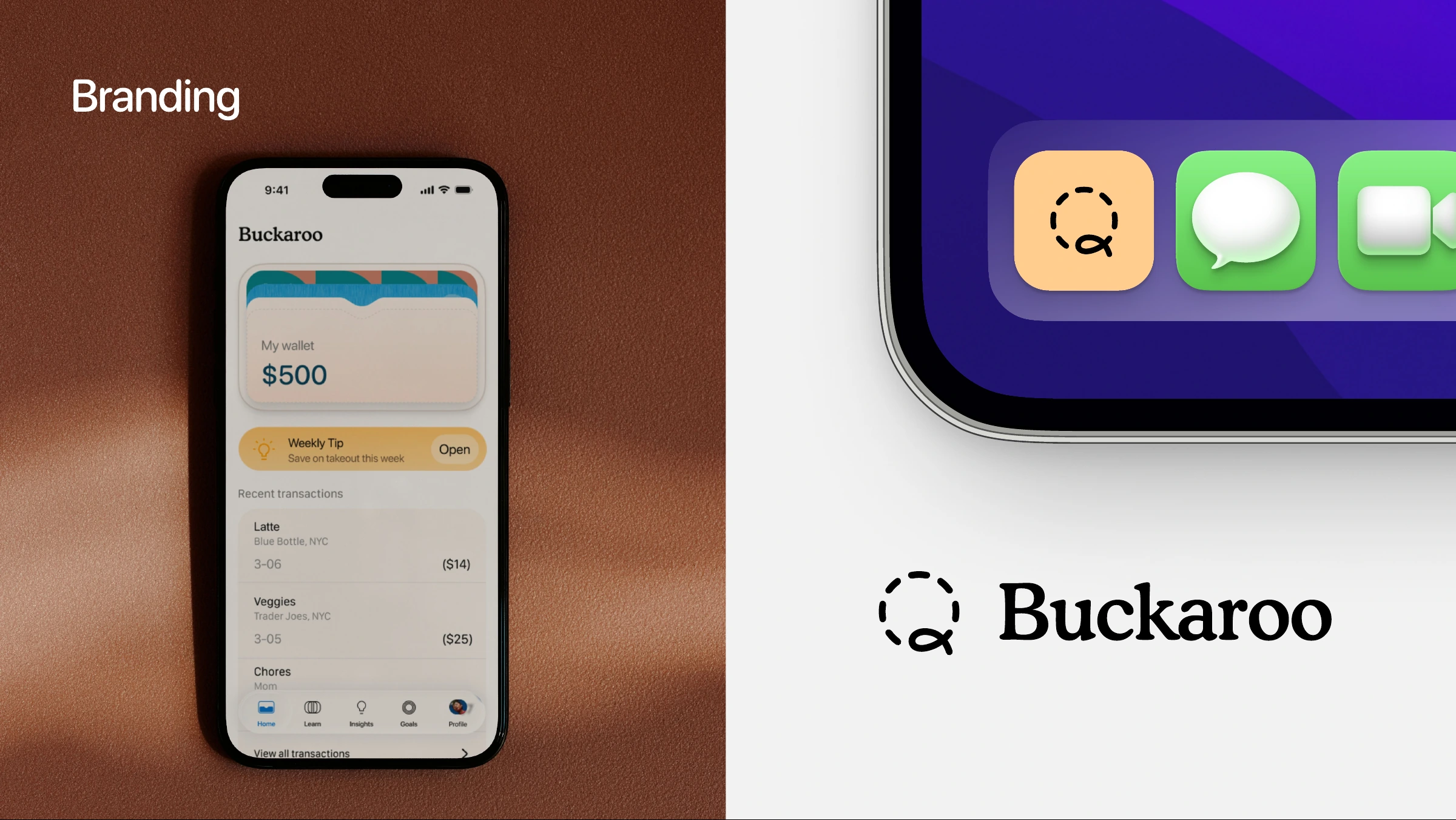
The visual language follows the same idea: warm surfaces, colorful category markers, rounded cards, and a characterful wordmark. The goal is an approachable place to return to, with amounts and actions kept easy to read.
The solution
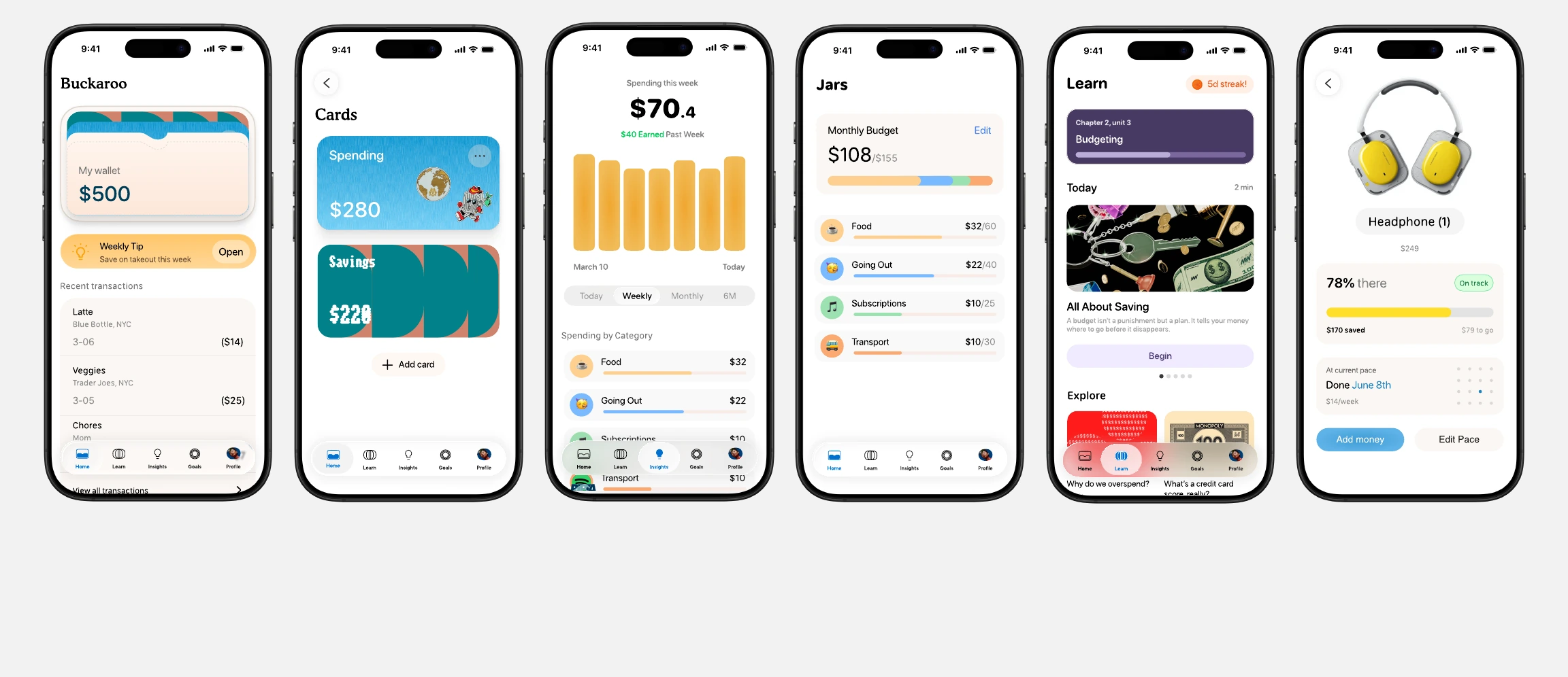
Wallet, Jars, Goals, Learn, and Insights work together: see what you have, decide where it goes, plan for something meaningful, and learn from the choices along the way.
01 / Wallet
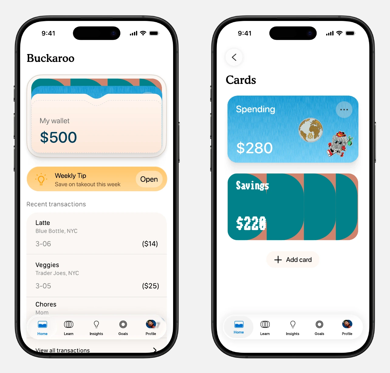
The wallet brings spending and savings into one tactile starting point. A balance, a weekly tip, and recent transactions answer the immediate questions before asking someone to go deeper.
Virtual cards give money a visible purpose, with room for users to customize the look to their personality.
A relevant weekly tip sits alongside everyday activity, connecting education to the choices someone is already making.
02 / Jars
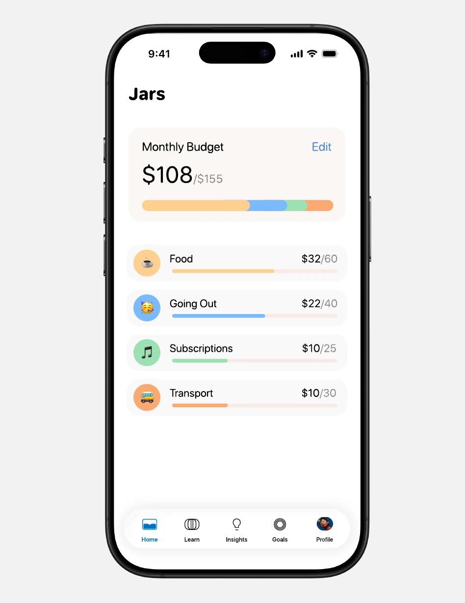
Food, going out, subscriptions, and transport are easier to picture than a spreadsheet. Jars turn those familiar activities into categories with their own limits and progress.
Each jar pairs its monthly allowance with a progress bar, showing what has been spent and what remains.
The concept supports daily, weekly, and monthly limits so a budget can fit the way someone actually spends.
03 / Goals
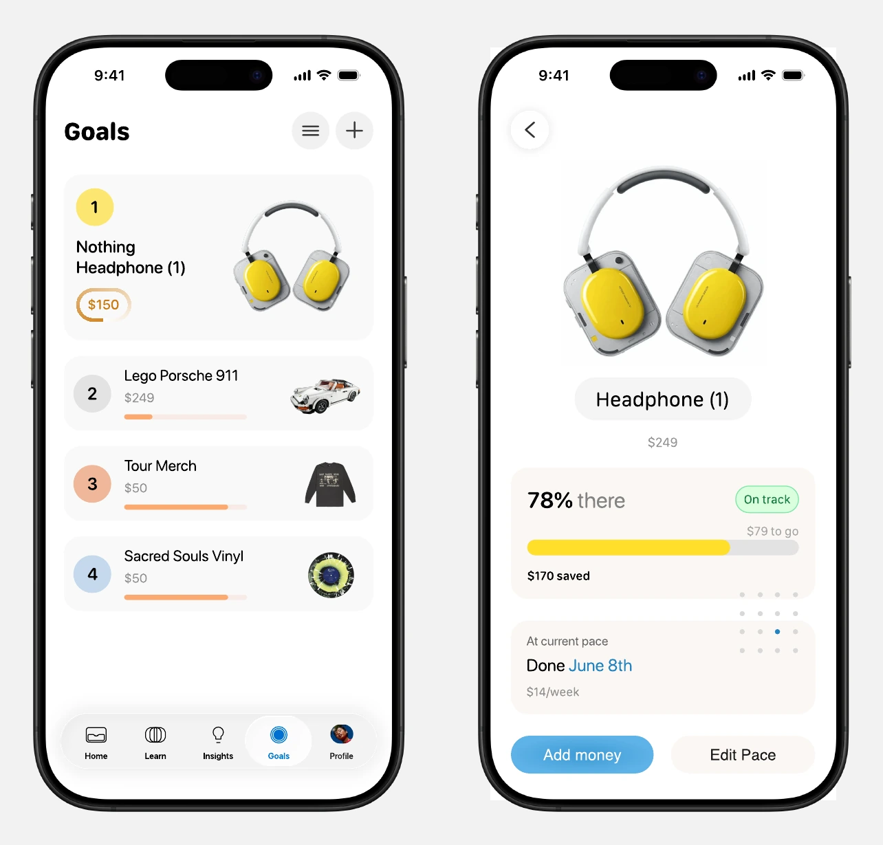
Saving becomes more tangible when it is attached to something someone cares about. The goal flow begins with a product link, then connects that wish to a weekly savings plan.
The concept pulls in a product’s name and price, giving a goal a recognizable image and a clear target.
Progress, the amount remaining, a weekly pace, and an estimated completion date make the plan easier to understand and adjust.
04 / Learn
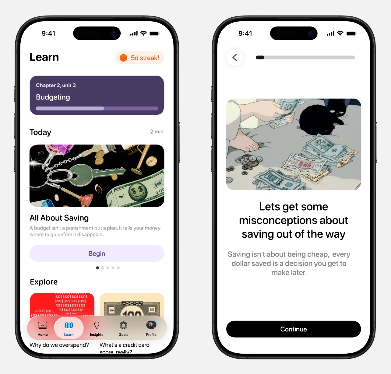
Financial education lives inside the wallet experience. Short lessons make it easy to begin, while structured paths and deeper topics leave room to build understanding over time.
Daily cards, short slide lessons, and quizzes bring a playful rhythm to topics that can otherwise feel intimidating.
A learning path provides direction; Explore lets users follow their own questions about spending, saving, and credit.
05 / Insights
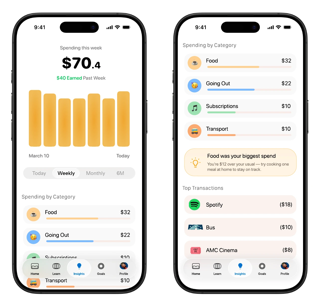
Raw transactions only tell part of the story. Insights organizes them into charts, category breakdowns, and contextual prompts that help someone reflect on their habits.
Time filters, a spending chart, and category totals support both a quick check and a closer look.
A nudge beside the breakdown turns a pattern into a small, concrete action, while the transaction list keeps the detail accessible.
User feedback
I shared Buckaroo with three young people, ages 17, 19, and 20. Their responses pointed to what felt intuitive—and to a distinction between cards and jars that still needed work.
Approachable learning
“The learning page felt really intuitive as it makes the subject of money feel approachable.”
Tangible categories
“Being able to sort savings into separate category jars is a great visual indicator for where my money goes”
An unclear distinction
“Cards caused some confusion. I wasn’t sure whether the card name should match the jar name or be something different.”
Reflection / Next steps
Buckaroo became a concept that brings financial education into the same place as everyday money decisions. The feedback suggests that tangible categories and approachable lessons are promising, while the relationship between cards and jars needs a clearer explanation.
The next iteration would focus on that distinction: explain what each object does, refine naming, and test whether users can confidently organize their money. To understand the impact beyond these first impressions, I would also need to evaluate how the experience supports learning and money habits over time.
A voice in every tap.